March 30, 2021
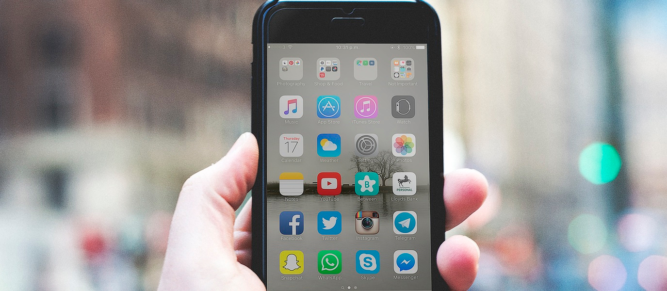
17 Tips to a Better Mobile Web Design
 The war between designers, developers, and user experience experts has raged for centuries… or at least 10 years. Should an app be beautiful or functional? The answer of course is BOTH, but the seamless integration of design and function is not always, well, so SEAMLESS. mobile app design
But it’s really NOT that difficult. Read these design and user experience tips to make your app kick ass.
- Design is a beautiful thing: But user experience is more important than design because frustrated users mean NO USERS. Each path to a task should be the shortest.
- Keep it simple: Minimalistic design makes it easy to find what you are looking for and keeps users on track with their tasks.
- QA, QA, QA: Another word for test, monitor, repeat. If an app doesn’t work always, USERS DROP OFF. mobile app design
- Keep it Simple: Simple but beautifully designed buttons and icons, keep focus where it needs to be, and add to the eye candy pleasure of the app.
- Don’t overuse icons and buttons: too confusing. Too distracting.
- Most frequently used icon or button: Easy to find, easy to use where fingers can easily use it.
- Don’t forget the thumb: Design for one-handed tapping- test your design using Invision to ensure one-handed usage.
- No one really gives a damn about background pictures. They are using your app for speed, so focus on that thumb.
- Time: Usually Users spend less than 2 minutes on an app. Make sure you give them what they need in two minutes or NO USERS.
- Website loyalty hard to find. Think about what people are passionate about: Food, Love, Children, Pets, Sports, Money, Health, and Gaming. Now think about how many websites there are that answer those needs. ‘Nuff said.
- Avoid multi-touch functions: people just don’t have the time. For example, instead of pinching with two fingers for zooming, make it a tap.
- Forget about that scroll: Just fuggedaboutit. Content that is scrolled to, is content that is in purgatory.
- Nav and content buttons at the top of the screen. Like, DUH.
- BIG buttons: for clumsy fingers. PLEASE.
- Ambidextrous controls: Make them full-width for the southpaws out there.
- Spacing Counts: if buttons are too close, mistakes are made, like “delete” instead of “save”. OUCH!!!
- Less text: means better APP
For a perfectly designed mobile website, check out our web design services.
